The Gradient Map is one of my favourite Photoshop adjustment layers. It is one of the best ways to convert a colour image to black and white and is also a wonderful way to colour correct or colour grade an image and even to control the luminosity or tones in an image.
A Gradient Map allows you to define a colour (or black and white) gradient and then this gradient is mapped to your image according to the luminosity (brightness levels) in the image.
When you first create a Gradient Map adjustment layer it will use the current foreground and background colours to build the gradient (the foreground colour will be mapped to the shadows, the background colour to the highlights).
Click the gradient in the adjustment layers Properties window and the Gradient Editor dialog will be shown (see Figure 1).
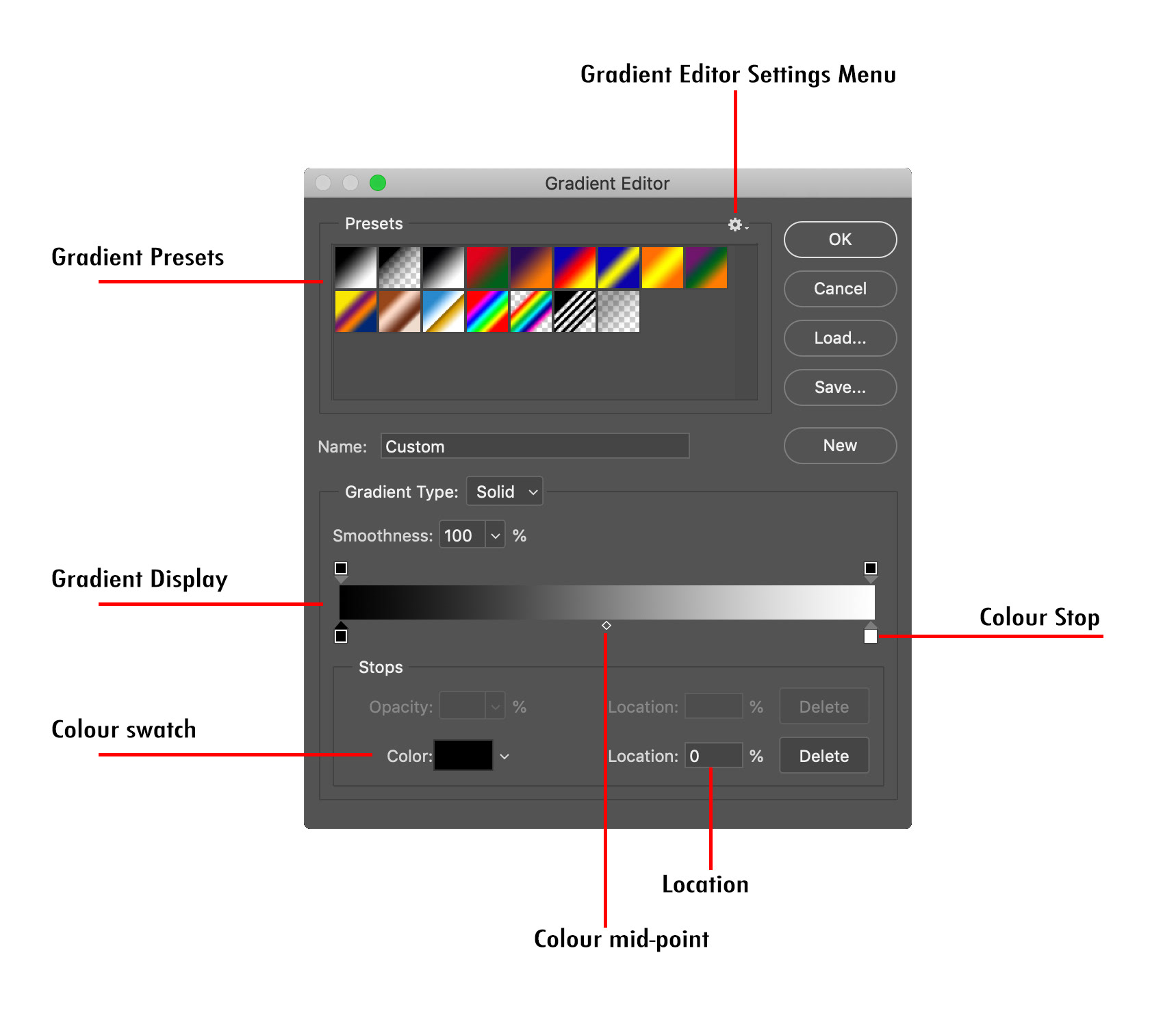
Fig 1 - The Gradient Editor
The current gradient is shown in the Gradient Display about two-thirds of the way down the dialog, the colours that will map onto the darks/shadows at the left of the gradient, those that will map onto the lights/highlights on the right.
Just below the Gradient Display you will see at least two small squares (with triangular caps) that are called Colour Stops. These define the colours that make up the gradient, and their position along the gradient display defines the transition from one colour to another.
To change the colour of a colour stop, click the colour stop then click the Colour Swatch (or double-click the Colour Stop) and the Color Picker will be displayed. Choose the new colour and press OK.
To add a new Colour Stop click just under the Gradient Display where you would like to add the Colour Stop.
To remove a Colour Stop click and drag it away from the Gradient Display, or click it to select it and press the Delete button.
Drag a Colour Stop left and right along the Gradient Display to change the colour transition along the gradient.
When you have a Colour Stop selected you will also see a small diamond either side of it, these are the Colour Mid-points. These can also be dragged left and right to change the transition of the colours between the two Colour Stops.
When a Colour Stop is selected it’s defined colour will show in the Colour Swatch and it’s position along the Gradient Display (expressed as a percentage) will be shown in the Percentage field.
Any changes made in the dialog box will be reflected live in your image.
You can click one of the defined Gradient Presets to select one of these. Figure 1 shows the presets that are installed as a Photoshop default.
Clicking the small cog at the top of the Gradient Editor dialog shows the Gradient Editor Settings menu (see Figure 2).
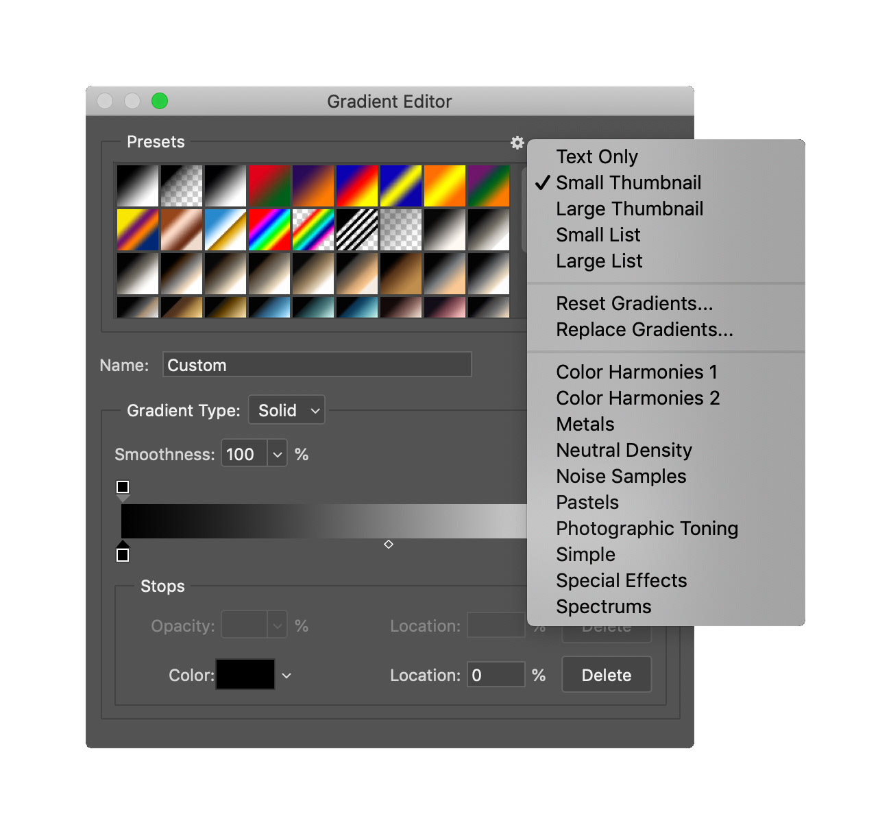
Fig 2. - Gradient Editor Settings Menu
The options in the bottom section of the menu allow you to add further gradient sets that come with Photoshop, in Figure 2 the “Photographic Toning” set has been added to the presets.
A simple black to white gradient as shown in Figure 1 can be used for Black & White conversion, and then you can move the black and white Colour Stops to define your black and white points, and move the Colour Mid-point to darken and lighten the midtones. However you may like to create a few different gradients to give yourself more control. The gradient shown in Figure 3 is another Black & White gradient but this one has three intermediate Colour Stops at the 25%, 50% and 75% points on the gradient, giving more flexibility in adjusting the tonality of the image.
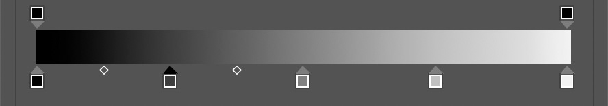
Fig 3 - 5 Stop Black and White Gradient
Using the same gradient as shown above, but with the Gradient Map adjustment layer set to Luminosity blend mode, is a great way to adjust the tonality of your image.
Colour toning, correction or grading is done with a coloured gradient, and can be done with Normal blend mode or Colour Blend mode, or for some even more striking results try Soft Light, Overlay or Hard Light blend modes.
Try gradients created with complementary colours for some lovely results (tone the shadows with blue and the highlights with a warm yellow for example).
Don’t forget to play with the opacity of the Gradient Map layers, for colour toning you will often want much lower opacities (20-50% depending on the image and gradient).
A gradient map can also be a good way to capture the “colour essence” of one image and overlay it onto another. Whilst it is possible to manually create the gradient from the target image, a wonderful little Photoshop plug-in I have recently discovered will do it for you much more easily.
ColourMapX from Nino Batista Photo not only simplifies the creation of Gradient Map adjustment layers, but it’s key feature is that it allows you to easily “capture” the colours from an image and create a gradient from them.
Figure 4 shows the ColourMapX panel, the second image shows the menu that is displayed when the … (three dots) are clicked on either the Current Palette or one of the saved Palette presets. The third image shows the preferences sub menu that is displayed when the small cog at the bottom of the panel is clicked.
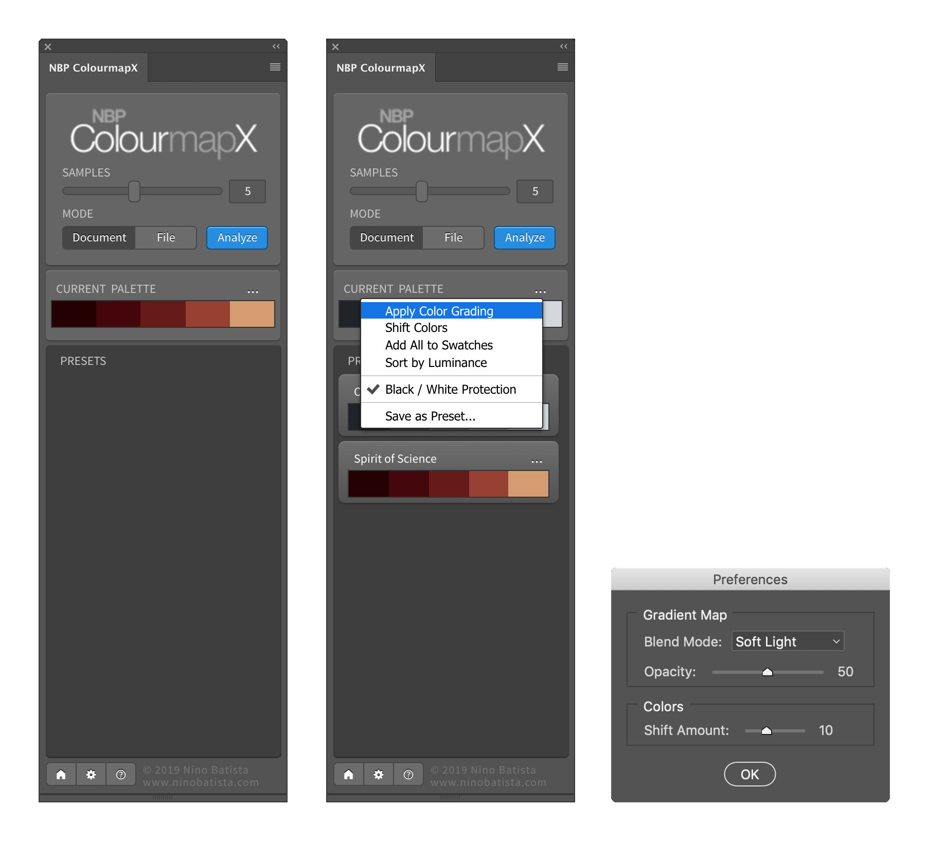
Fig 4 - ColourMapX Panel
To extract the colours from an open document simply set the number of samples you want (this will become the number of Color Stops when you create a Gradient Map from it later), and press the Analyze button. The Current Palette will now show the extracted files.
Applying these to another file is as simple as opening that file and making it active, then clicking the … on the Current Palette and selecting Apply Color Grading. ColourMapX will create a Gradient Map adjustment layer with the Blend Mode and Opacity defined in the ColourMapX Preferences dialog (see Figure 4). Obviously once the Gradient Map layer is created you can adjust the Blend Mode and Opacity to your taste.
Figure 5 shows a couple of sample images and the ColourMapX extracted colour sets and the resultant gradients.
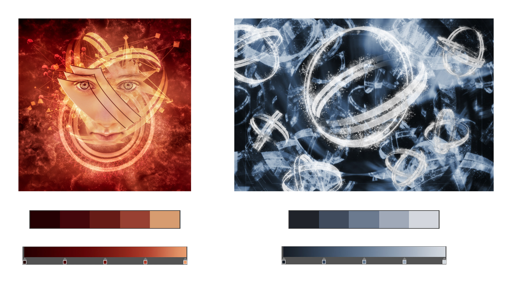
Fig 5 – Sample ColourMapX Gradients
You can save extracted colour sets as presets in ColourMapX for use later. ColourMapX is a nice little panel, I am enjoying it a lot.
It is available for a cost of USD$30 (approximately AUD$50) from the website below.
Don’t underestimate the power of Gradient Maps, they are one of the most flexible and powerful layers.
This article was first published in the October 2019 issue of Artists Down Under magazine.