A “visualization layer”, often referred to as a “check layer” is a layer added to Photoshop that temporarily changes the way your image looks so that you can more effectively edit it.
When editing an image, we will often not easily see issues that are there, and often it is difficult to tell what the actual issue is. For example, as we are viewing a portrait and there is discolouration or patchiness on the skin, it can be difficult to tell if the problem is the luminosity, the colour (hue) or the saturation, or a mixture of these.
Changing the way we view our image (for example only viewing the luminosity data when dodging and burning) can make it easier to identify, isolate and fix the issues.
If we can use an adjustment layer (or a combination of adjustment layers) to perform this visualisation we have the added benefit that if we insert our modification/editing layer(s) underneath the visualisation layer we can see the effect of our edits on the visualisation layer as we make them (see Figure 1), the visualisation is “active”.
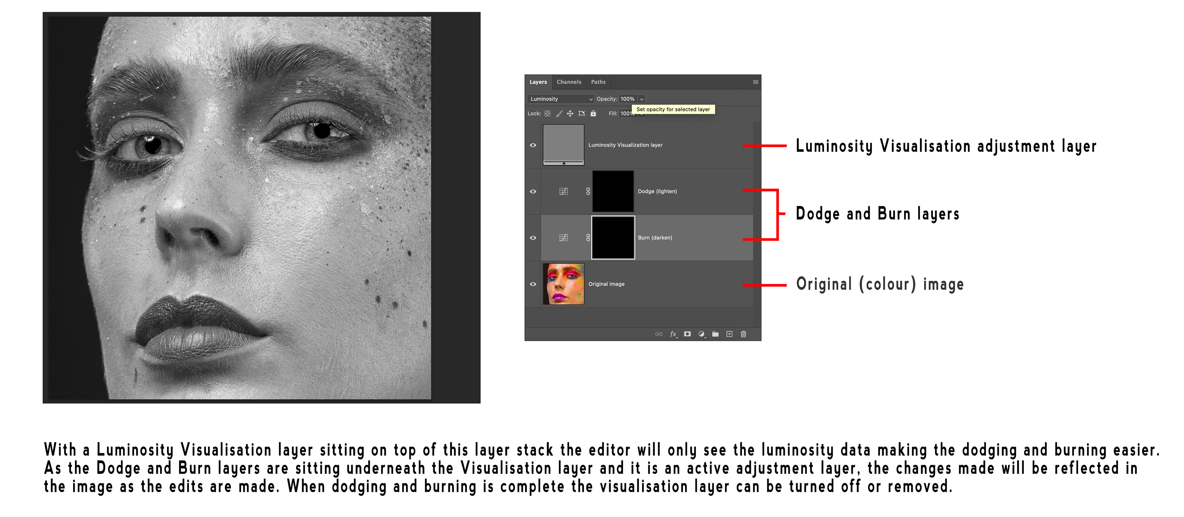
Fig 1 - Using a Visualisation Layer
There are many different types of Visualisation Layers, in this article I will show you how to create five different types.
Luminosity (Luma)
Use a Solid Color adjustment layer set to 50% grey (H = 0, S = 0, B=50%) with the blend mode set to Color.
This looks like a black and white version of your image and is your pure Luminosity data, excellent for dodging and burning.
Colour (Chroma)
Use a Solid Color adjustment layer set to 50% grey (H = 0, S = 0, B=50%) with the Blend Mode set to Luminosity.
This shows the colour data (including both hue and saturation) for your image, areas of the image that contain no colour data show in 50% grey. This can be used to identify colour differences.
Saturation
Create a Selective Colour adjustment layer and set Relative / Absolute to Absolute. For each of the six colors (Reds, Yellows, Greens, Cyans, Blues and Magentas) move the Blacks slider all the way to the left (-100) and for each of the three neutrals (Whites, Neutrals and Blacks) move the Blacks sliders all the way to the right (+100).
This adjustment will cause your image to look like a mask, where the most saturated areas are lighter (white) and the least saturated areas are darker (black). Very useful for identifying where issues are due to saturation.
Hue Map
A hue map shows the actual hues throughout your image. Each pixel’s hue is shown at full saturation and brightness. Great for identifying colour differences, especially in areas of lower saturation.
Creating a hue map requires three adjustment layers.
Create a Black & White adjustment layer and choose the Maximum Whites preset (this moves all the colour sliders to 100), then change the blend mode to Difference. Duplicate this layer on top of the first one and change the blend mode of this second one to Divide. Now add an Invert adjustment layer on top of the two Black & White adjustment layers.
For convenience of turning the hue map on and off it can be handy to place these three adjustment layers in a group.
Solarization
You can create a Solarization effect using a Curves adjustment layer and creating an extreme zig-zag curve (see Figure 2).
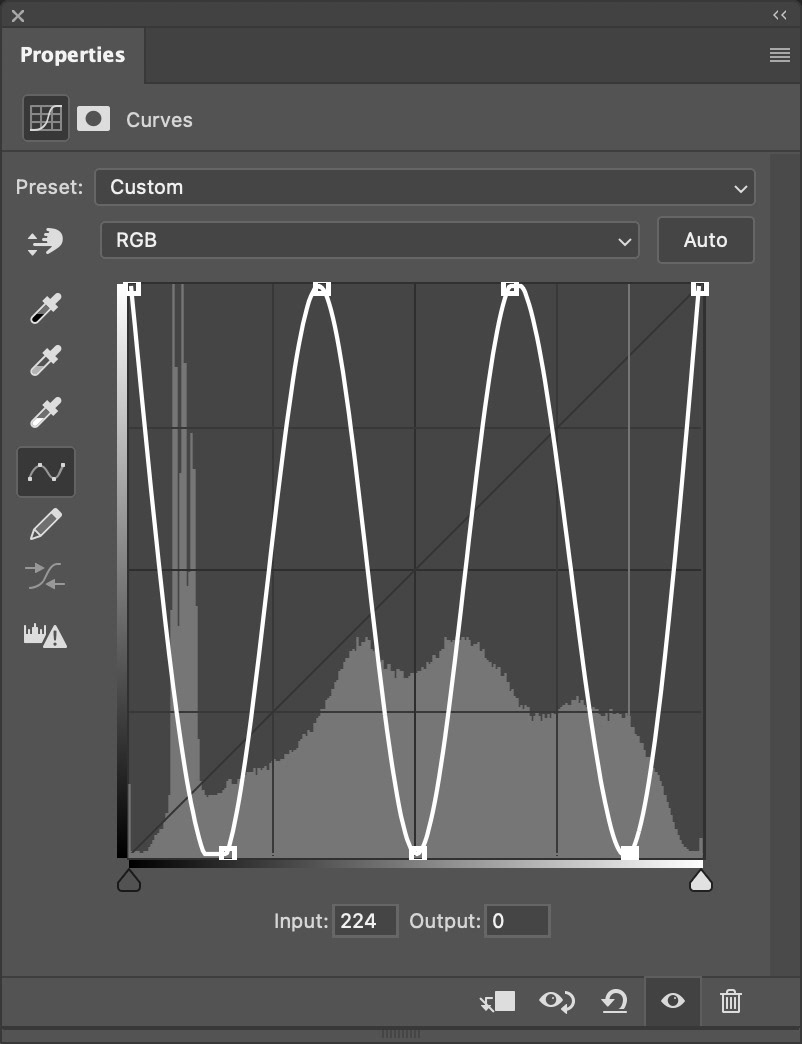
Fig 2 - A Solarisation Curve
This creates an extreme style of contrast with a “negative” look that is often used by retouchers to help identify imperfections that are difficult to see in the original image.
To reduce the saturation in the resultant image you can change the blend mode to Luminosity and even add a Black & White adjustment layer to create a monochrome version.
For reference the curve points for the curve shown in figure 3 are (0,255); (43,0); (85,255); (128,0); (170,255); (213,0); (255,255), but keep in mind that any zig-zag high-contrast curve will work, there are many different ones in use.
Figure 3 shows an example image along with the results from the various visualisation layers.
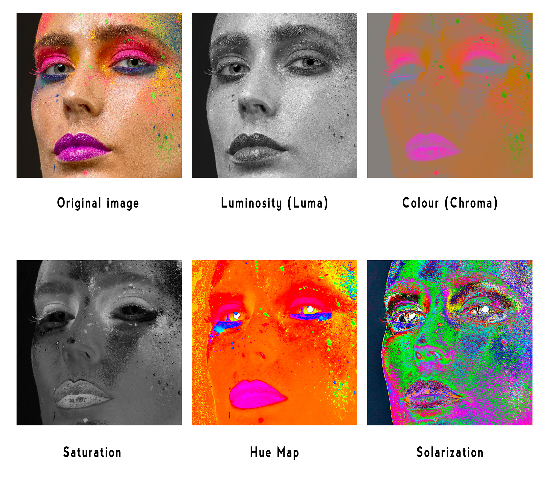
Fig 3 - Visualisation Layer examples
Visualisation layers are an excellent way to analyse an image, to better see issues or imperfections, and to allow you to break down difficult edits into multiple steps.
For things like the Solarization curve settings and the Saturation Selective Color settings it is a good idea to save presets to re-use later.
You could also create Photoshop actions to create these various visualisation layers easily in the future.
Don’t forget that if you are using healing/cloning tools in layers underneath your visualisation layers you will have to make sure they are set to “Current and Below” (or Current Layer if working on a Stamp Visible layer) rather than All Layers. If on All Layers you will heal/clone in details from the visualisation layer.
If you are as finicky as I am about editing you will find visualisation layers very helpful.
This article was first published in the January 2026 issue of Artists Down Under magazine.