In parts one and two of this series, we introduced colour channels and a few ways to manipulate and use them, like the Apply Image and Calculations commands. In this final part we will look at some specific examples of using channels to create masks and for creative effects.
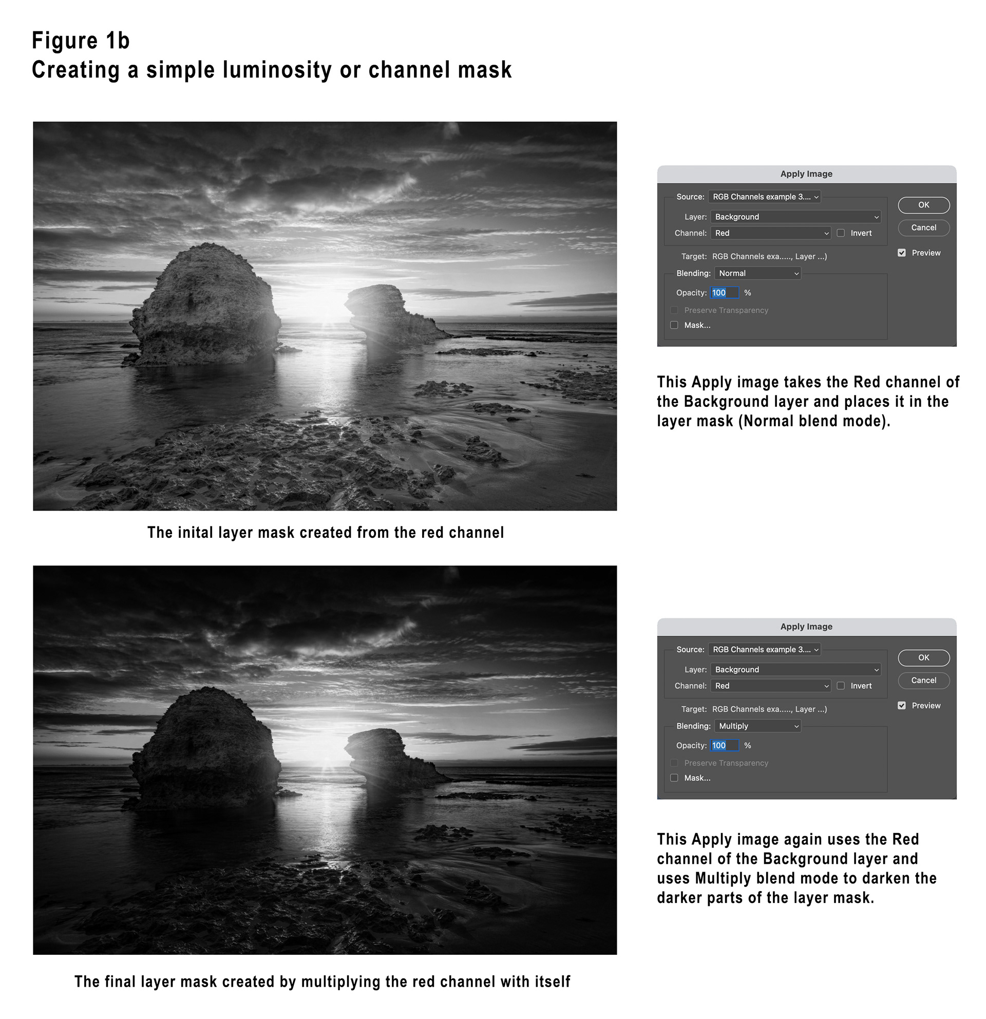
Example 1 – Creating a simple luminosity or channel mask
In this sunrise seascape I decided I wanted to intensify the orange colouring in the sky around the rising sun. I did this using a Solid Colour layer set to Soft Light blend mode. Without a layer mask this washes out the entire image, we need to restrict the adjustment to the lighter areas of the image, and restrict it from the dark areas.
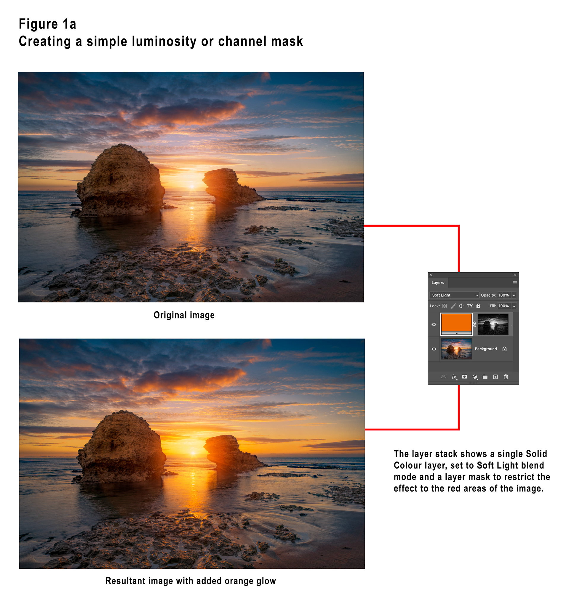
In the Channels panel, Cmd+clicking for Mac (or Ctrl+clicking for Windows), the RGB (composite) image will create a “lights” selection for the image. This can be used to create a layer mask. Cmd+clicking for Mac (or Ctrl+clicking for Windows) any of the colour channels will create a selection based on that channel.
Another way (and I think a superior way) to achieve the same result is to click on the layer mask of the Solid Colour layer and then use the Apply Image command to “apply” the channel mask to the layer mask. I think this is superior because it is easier to do and also allows easier cycling between the various channels to see which produces the best result.
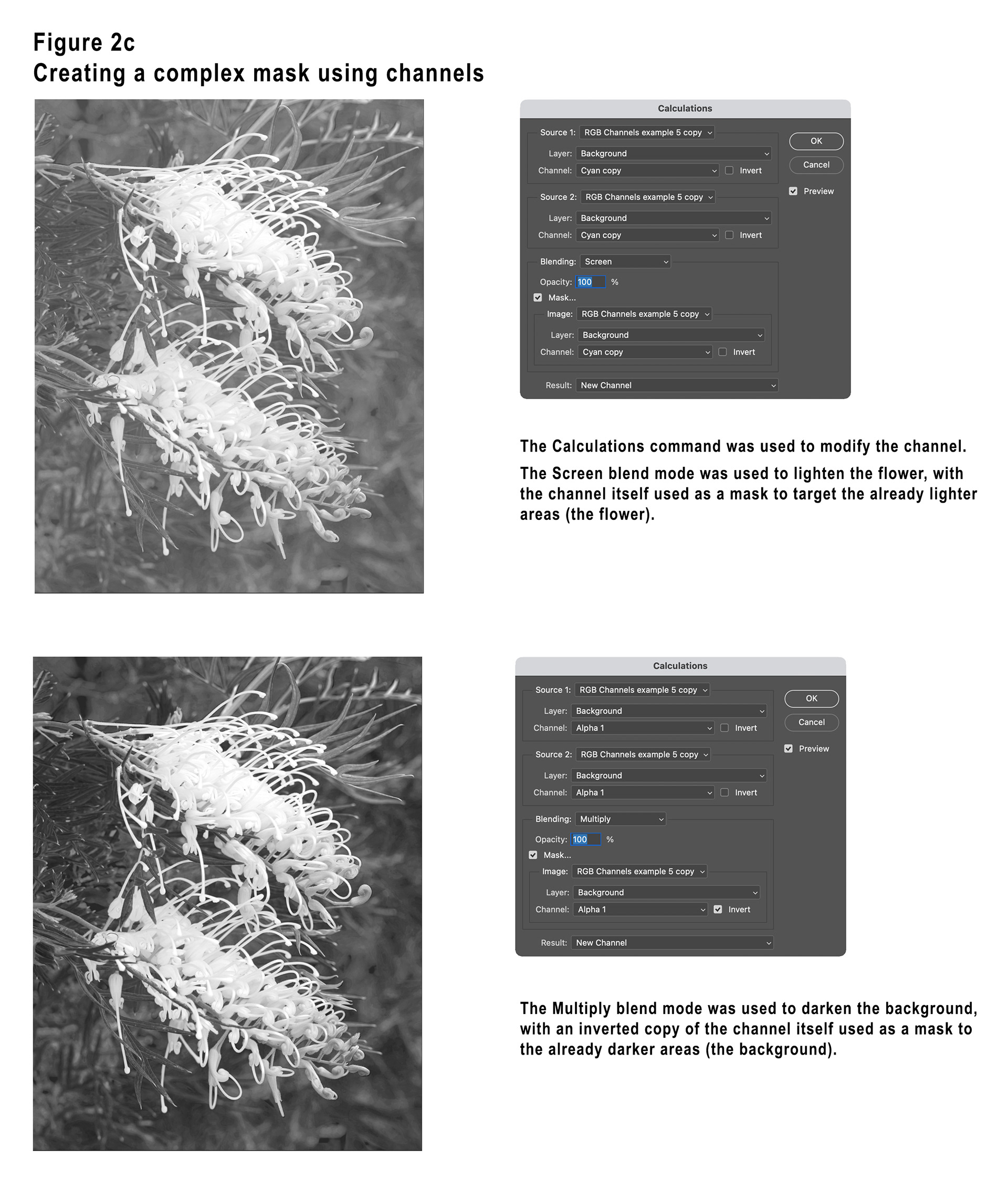
Example 2 - Creating a complex mask using channels
In this image of two beautiful Grevillea flowers I decided I wanted to darken the background and brighten and intensify the colours of the flowers.
I ended up doing this with two curves layers (one to darken the background and one to brighten / intensify the flowers) using a mask and it’s inversion to control the adjustments.
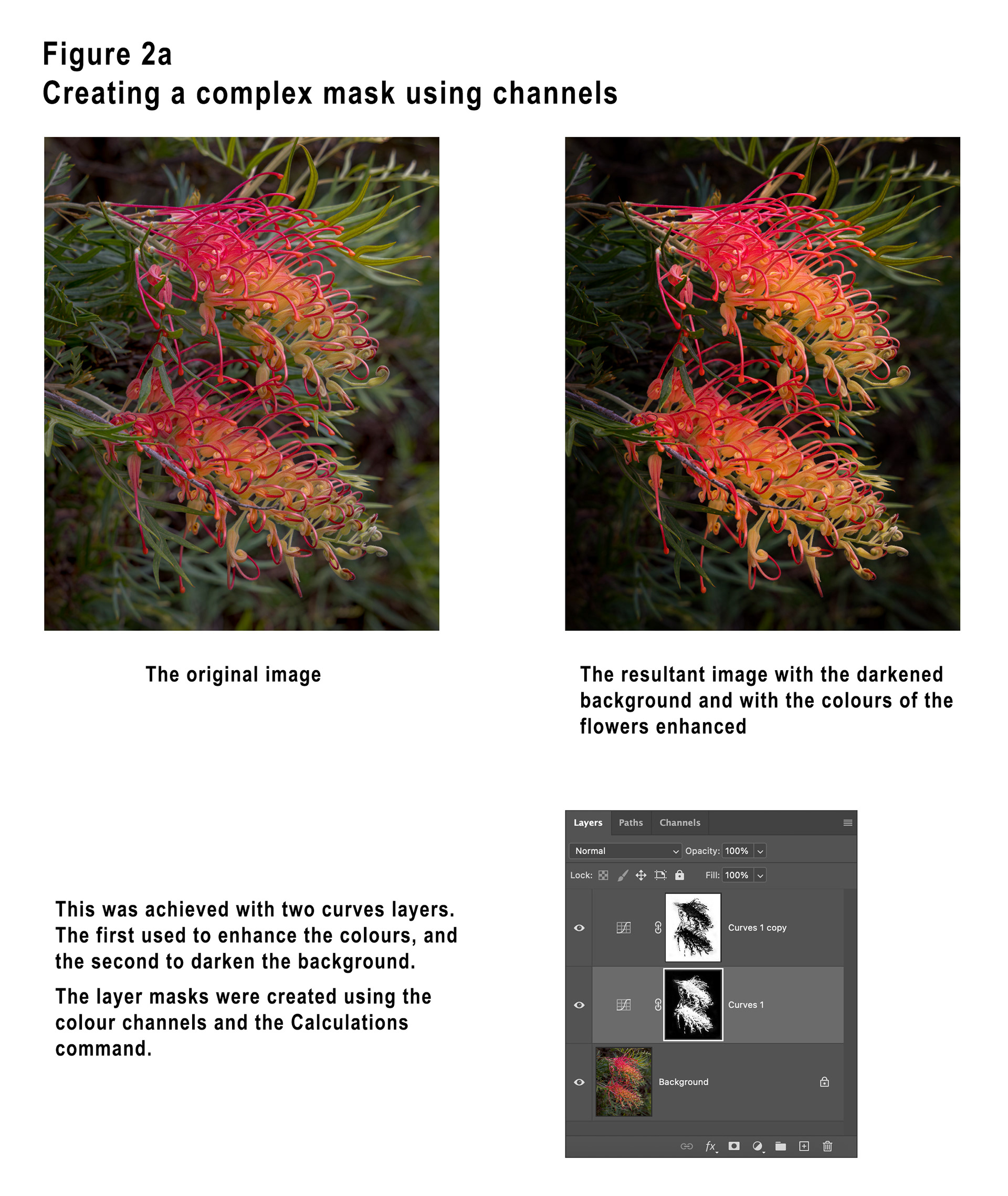
Obviously the Grevillea flowers are very complex subjects and the various selection tools do not do a good job of selecting them, whereas using channels did a great job.
Examining the channels, I saw that the red channel was a good possibility but I decided to check the CMYK channels as well. The easiest way to do this is to create a duplicate of the image, use the Image / Mode menu command to change it to CMYK and then inspect the channels. This is safer than converting your original image as the conversion can sometimes modify colours.
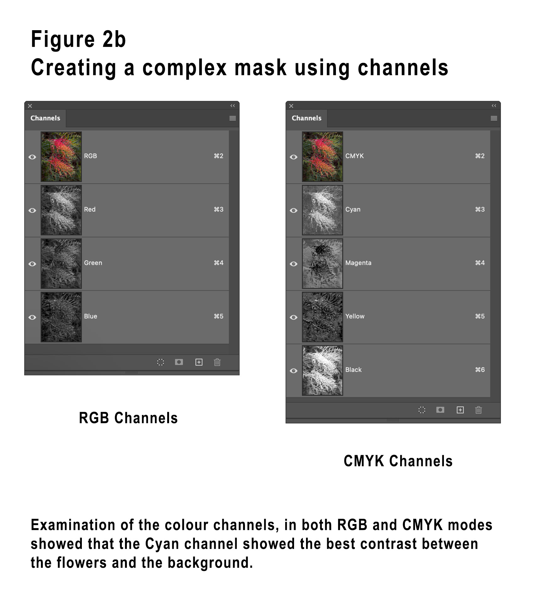
I thought that the Cyan channel was a better possibility as a basis for the mask I wanted. Still working in the CMYK version I duplicated the Cyan channel and then used the Calculations menu command to manipulate the mask. I performed multiple operations each time creating a new channel which then becomes the input to the next iteration.
I used the Screen blend mode (to lighten the flower), then Multiply to darken the background, then repeated these again. Each iteration was basically blending the same channel with itself.
When performing each Screen iteration I used the channel itself as a mask, given that the flower is already a lot lighter than the background, the Screen “lightening” is then applied more to the flower than the background.
When performing each Multiply iteration I used an inverted copy of the channel itself as a mask, in the inverted channel the background is lighter than the flower, the Multiply “darkening” is then applied more to the background than the flower.
I then further modified the channel using a black and white brush in “Overlay” mode to end up with the version shown in Figure 2d.
When using Overlay mode to brush on a mask, when using black paint the whiter areas are protected, and when using white paint the blacker areas are protected.
Once happy with the mask I then used the Duplicate Channel command (by right-clicking on the channel) and specified my original document as the target, then it was used to create a layer mask for one Curves layer, and then an inverted copy used for the layer mask of the other Curves layer.
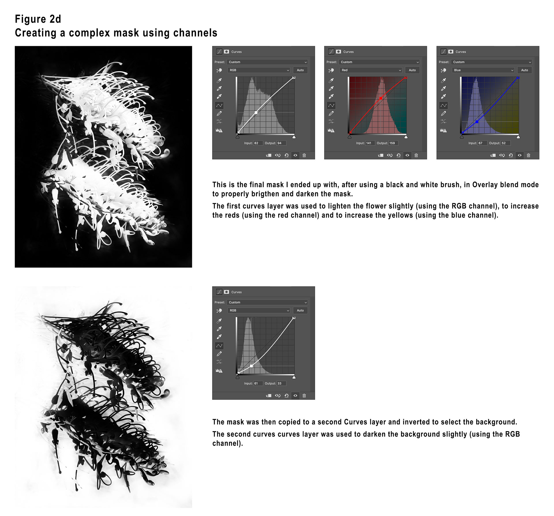
It is worth noting here that when manipulating the Curve for one of the R = Red, G = Green or B = Blue channels that dragging the curve upwards intensifies that colour. Dragging the curve downwards will intensify that colours opposite colour. The opposite colours are C = Cyan, M = Magenta and Y = Yellow. So, noting the two image modes RGB and CMY(K) is a good way to remember the opposite colours. You’ll note in Figure 2d that I have pushed the Red channel up and the Blue channel down.
Example 3 – Getting a little creative with channels
In this example I will demonstrate a creative way to use colour channels.
I took one of my original photographs and duplicated the layer. I then went into the Layer Styles dialog for the duplicate layer and turned off both the Green and Blue channels, leaving only the Red channel.
I then used Free Transform to move and enlarge the Red layer.
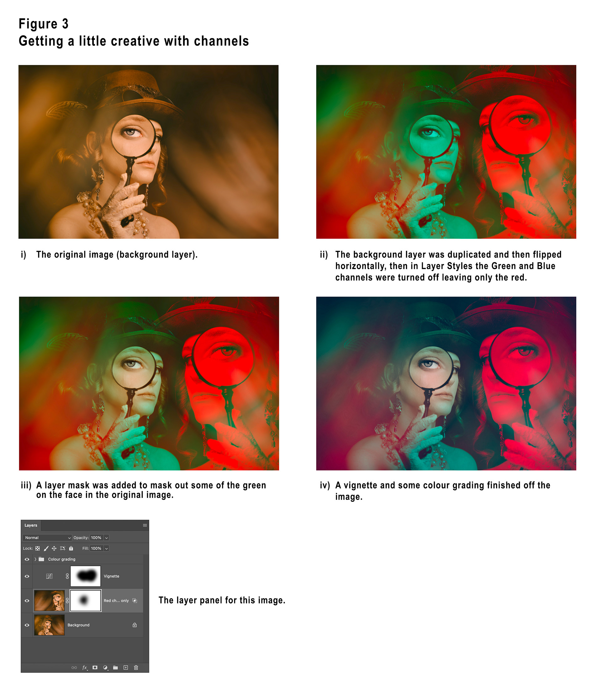
I then decided to mask out some of the layer to reveal the original colour of the face in the original document.
A vignette and some colour grading (largely to mute the bright reds) finished the image.
I hope that these three articles have given you some inspiration to experiment with channels in Photoshop.
This article is a companion to the article published in the April 2026 issue of Artists Down Under magazine.