In recent times there have been huge improvements in the selection tools available in Lightroom and Photoshop. Despite this, there are times when you will simply get better results using “old school” methods. One such example is using Channels to create selections and masks.
If you do not see your Channels panel in Photoshop, use the Windows / Channels menu command to display it. I like to keep my Channels panel nested with my Layers panel.
If you do not see your Channels panel in Photoshop, use the Windows / Channels menu command to display it. I like to keep my Channels panel nested with my Layers panel.
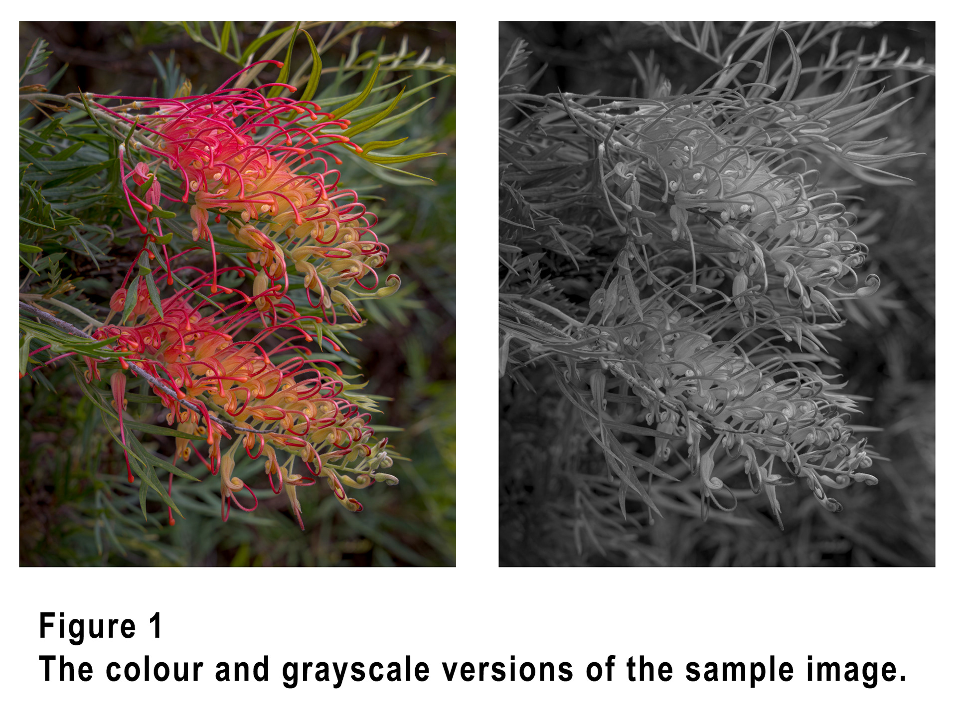
What you see in the Chanels panel will vary depending upon the image mode you are working in. Most of us spend most of our time in RGB mode, but Figure 2 shows the Channels panel for RGB, CMYK, Lab and Grayscale, for the sample image shown in Figure 1.
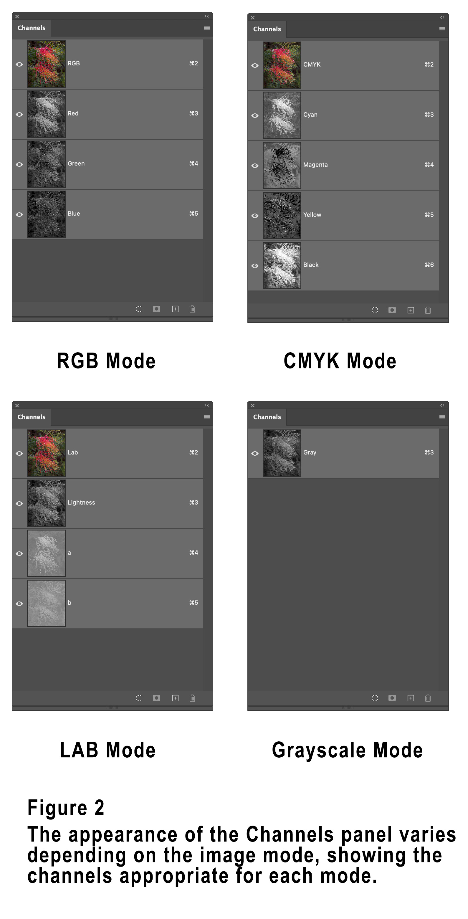
In each of the colour modes you will see an entry in the Channels panel for each of the colour channels as well as an entry for the composite image.
For RGB and CMYK mode the composite channel is labelled RGB or CMYK, with the Red, Green and Blue channels (for RGB) and the Cyan, Magenta, Yellow and Key (Black) channels each showing a grayscale representation of the respective colour in your image.
Lab mode is slightly different in that there is a composite channel, a separate Lightness (Luminosity) channel and two colour channels labelled a and b. The a channel specifies green through magenta, and the b channel blue through yellow, much like the Tint and Temperature sliders used for white balance.
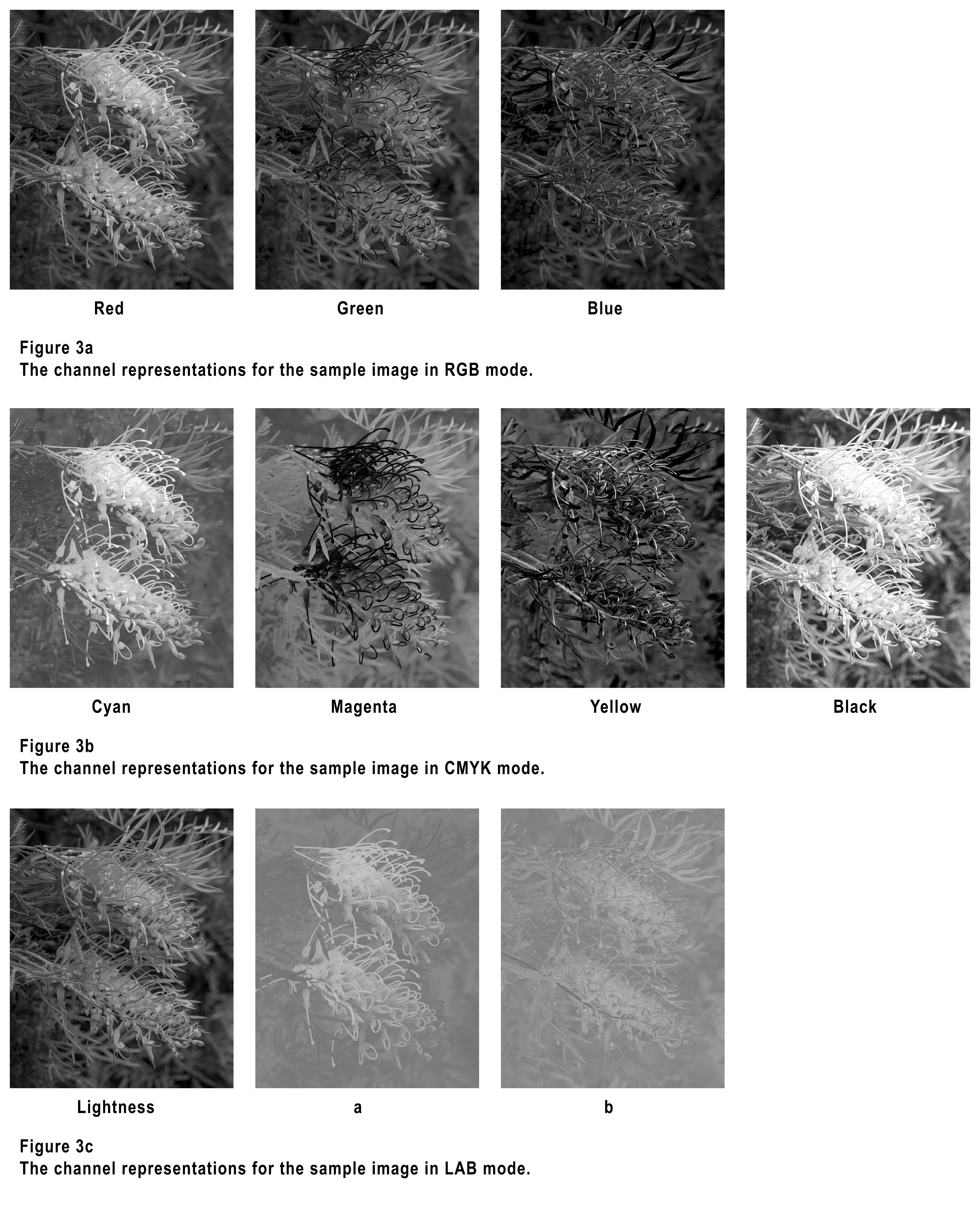
Figure 3 shows Channels representations for the sample image for all these colour modes, as well as Grayscale mode.
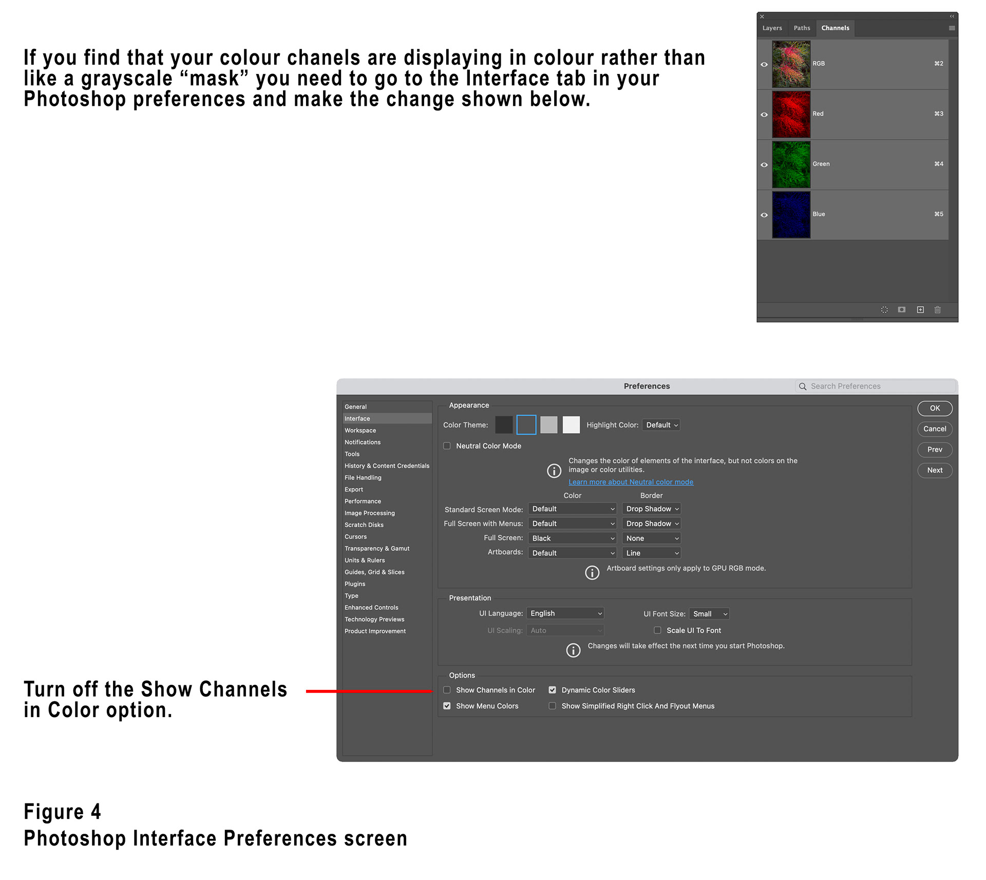
If you find that Photoshop is displaying a colour representation of the channels in your Channels panel (see figure 4) you will need to uncheck the “Show Channels in color” option in the Interface tab of the Photoshop preferences. The grayscale representations are much easier to interpret.
When in RGB mode, every pixel of your image is a combination of red, green and blue, they mix to create all the colours and tones in your image. The Red, Green and Blue channels show representations of the amount of each colour there is each pixel. In the Red channel for example, if a pixel has a fully saturated red component it will show as white in the Red channel representation. If there is no red in a particular pixel it will show as black. For values in between fully saturated and no red, different shades of grey show how much red there is in each pixel. The lighter a part of the image shown in the Red channel is, the more red it contains, the darker it is the less red it contains.
This obviously holds true for the Green and Blue channels as well.
Given the ways colours mix though, it can sometimes be hard to interpret, for example in the RGB colour model, white is the combination of fully saturated red, green and blue, so any white pixels in your image will show as white in all three colour channels. Similarly black is the result of no red, green or blue so any black parts of your image will show as black in all three channels.
Most colours in photographs will not be pure red, green or blue, but will be a combination of all three, so the various channels will show varying shades of grey for any particular colour.
It is worth noting that when looking at the channel representations for CMYK mode the “mask” is reversed, that is more of the colour means a darker representation in it’s channel, less of the colour means a lighter representation.
The best way to use the channels for selections or masks is to examine them all when you want to make a particular adjustment or selection and see if any of the channels show good separation / selection in that area of the image.
For example, in the sample image of the Grevillea flowers I used the Red channel to create a very good mask of the flower to create a colour boost adjustment. If you look at the Red channel representation in Figure 3, you’ll see that this channel shows the flower in a very light shade (well selected), with the background less selected, a good basis for a mask. You’ll note that this selects all of the flower, including the bits that are more orange/yellow, because they also contain a lot of red. In my case this didn’t matter because I wanted the whole flower selected, but if I had just wanted to select the red skinny pieces of the flower (apparently they are called “styles”), then I might have been better to have used an inverted version of the Green channel in which they are shown very dark, an inverted version of the CMYK Magenta channel would also have worked well.
Creating selections and masks using channels will create accurate, smooth masks that are often very superior to those created using selections.
You’ll notice in the Channels panel that each channel has a hotkey displayed on the right-hand side (for Mac Cmd+2, Cmd+3, Cmd+4, Cmd+5 and for Windows Ctrl+2, Ctrl+3, Ctrl+4 and Ctrl+5). Pressing these will display the associated channel representation, so Cmd+3 (Mac) will show the Red channel when in RGB mode for example, pressing Cmd+2 (Mac) will return to viewing the composite image.
Using these hotkeys in conjunction with the Option (Mac) or Alt (Windows) key will create a selection based on the relevant channel, so on my Mac if I press Option+Cmd+3 it will create a selection based on the Red channel. Then with that selection active, if I create an adjustment layer it will create a mask based on the channel.
Don’t forget that you can also use techniques to modify the mask such as Levels or Curves to increase contrast and of course you can invert the mask using Cmd+I (Mac) or Ctrl+I (Windows).
If you want to know more about Lab colour mode, please check out my earlier article which can be found on my website here,
Shortly after I had written this article Blake Rudis released a new course called “Channels: Beyond Luminosity Masking”, if it is of interest you will find more information here,
This is the first article in a series, parts two and three are available on my website here,
This article was first published in the April 2026 issue of Artists Down Under magazine.